Donnerstag, 20. August 2015

Featuring Viva Decor Paints

The company Viva Decor does not only sell great stamps but great paints and structure pastes as well.

I have already tried the 3D Snow which comes in a plastic bottle and is easy to handle. I'm really happy with the results and I'm looking forwards to use the paste for christmas cards and winter greeting cards.

For those who speak German: Die Kreativtesterin Linda hat verschiedene "Schnee-Spender" ausprobiert: Kreativtester - "Let it snow"


I'm not totally convinced by the "3D-Stempelfarbe" by Viva Decor. I used the paint and a dabber to create a great shiny golden background on a page in my Art Journal. The undercoat is rough and really interesting to touch. Stickers don't stick very well but I had acceptable results with embossing powder.

I tested the paint with a) a clear stamp and b) a plastic stencil. Both were hard to clean up afterwards. The impression of the stamp was squishy. But I'll give the paint another try with another stamp less delicate lines.


The next thing on my shopping list is the Viva Decor INKA GOLD. I love the Inka Gold paint! It's a creamy paste, with beeswax in it. You can use it with your fingers which is always a bonus for me. Inka Gold can be used on many surfaces. On this art page I gilded the structure paste with it. And Inka Gold comes in many colors like silver, platinum, green, red, blue, and purple.

Bei Viva Decor gibt es noch viele weitere schöne Bastelmaterialien zu entdecken, wie Schablonen oder Designpapiere.

Mittwoch, 19. August 2015

Featuring Viva Decor Stamps


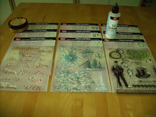
my Viva Decor treasures

Due to recent developments I'd like to present the products of Viva Decor, a Germany company (yeah, home country!). Some of their stamp sets were the first stamp sets I've ever bought and thus they are the foundation of my current crafting addiction. 
As far as I can say, the products are of good quality and I really like the motives because they are not sugary and some are steampunk, too. The sentiments are in German which is very much appreciated.

 
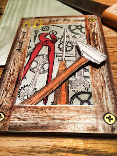
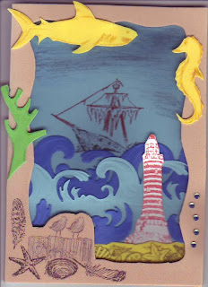
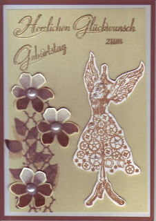
As you can see, I keep using the stamps over and over again for card making as well as my art journals. Especially the vintage sets with their gears and tools and gentlemen keep popping at in my works.


Set: "Gentleman"
Set: "Vintage Tools"
Set: "At the seaside"
Sets "Steampunk Angel" and "Text 1"

Samstag, 1. August 2015

H is for Heaven's Open

This page took a while until it was finished. The date states 20th of July but actually the finishing touches were done this morning. The 8th page of my ABC Journal features the song "Heaven's open" by Mike Oldfield. For the album he chose to use the name "Michael Oldfield" (so it's not a mistake).


I used the following stamp sets and stencils:
IndigoBlue: Design Alphabet - it's my favorite alphabet.
Lawn Fawn: Blue Skies - for the hot air balloon
Tim Holtz - Clockwork (stencil)

Sonntag, 12. Juli 2015

G is for Gloria


This morning I finished the seventh page of my new art journal featuring an abc of my favorite pop songs. There are three versions of the song "Gloria", originally performed by Umberto Tozzi. Usually I start with singing one or two English lines and than continue in German because I know the text better. Yet the page refers to the content of the Italian text.


I used the following stamp sets and embossing folders:
Rayher: Vintage Swirls - in the corners
Spellbinder Bossabilities: Venetian - background pattern in the sky
Stampin Up: Aus dem Häuschen / Holiday Home- the house
Darice Embossing folder: Crackle - the structure of the desert
RhynDesign: Water Effects 1 - the waterdrops.

The "Water effects 1" and "Water effects 2" are awesome stamps because they look really realistically. Please check out the cards made by my friend Heike: Water Effects 

Freitag, 10. Juli 2015

Happy 75th Birthday

Hello! Alright, let's try a new concept: Once I'm finished with a project, I'll post it in my blog right away, without a long comment about how I did it, what materials I used, etc. So here's a card for a 75th birthday.


The fish stamp is from the Stampin' Up Set "By the Tide", the mermaid from the Chocolate Baroque Set "Seadragon" and the paper is my beloved "Seashore" from Prima Marketing. The birthday greeting is from Viva Decor. Not to forget the embossing effect which derives from the embossing folder set "Waves & Bubbles" (Sizzix/Tim Holtz).

Montag, 23. Februar 2015

Art Journal Seite 13: "Bücher sind wie Schiffe"


"Bücher sind wie Schiffe"

Die Reihenfolge der Beiträge in meinem Art Journals habe ich nicht dem Zufall überlassen. Ich habe zuerst die Seiten ausgezählt und durchnummeriert und dann die Inhalte gleichmäßig verteilt, sodass auf zwei Doppelseiten, die meine Werke vorstellen, eine Seite mit einem Zitat oder einem Spruch zu den Themen Bücher und Lesen folgt. Auch die Farbgestaltung habe ich im Vorfeld geplant. Die Buchcover bringen natürlich ihre eigenen Farben und die passende Reihenfolge mit, aber bei den Zitaten konnte ich die Seiten frei verteilen, sodass das Art Journal schön bunt wurde.

Ich hatte ausgeknobelt, dass die vorliegende Seite von Blautönen dominiert werden sollte. Zuerst wollte ich den Spruch "Bücher sind Schiffe, welche die weiten Meere der Zeit durcheilen" vorstellen. Doch als ich davon Verena erzählte, meinte sie: "Bücher sind wie Schiffe, einige haben die Pest an Bord".

Wogende Wellen

Natürlich habe ich mich sofort für den neuen Spruch entschieden. Die Schiffchen sind leider nicht 'richtig' gefaltet, da sie sonst zu dick geworden wären, sondern ich habe sie zuerst gefaltet (winzig kleine Schiffchen!) und dann zerschnitten. Der Rahmen wurde inspiriert von Helen Allen's Art Journal Seite "A Mermaid's Tale"; die einzelnen Stücke sind aus Design-Papier ausgeschnitten. Die Fähnchen auf den Schiffen und die Insel habe ich auf einem Farbdrucker ausgedruckt. Ratet mal, welche Insel das ist!

Für das Flaggenband habe ich Buchcover ausgedruckt, auf schwarzes bzw. rotes Papier geklebt, ausgeschnitten und an einem roten Faden befestigt, den ich dann durch das Papier gestochen habe. Wenn ich das Art Journal schüttele, schlagen die Fahnen lose (im nicht vorhandenen Wind).

Herzlichst, Charlie

Freitag, 20. Februar 2015

Art Journal Seite 12: "Die Gralsdienerin"


Die Gralsdienerin
Shit happens - aber beim Basteln werden aus "accidents" gemeinhin "happy accidents". Geht etwas schief, sind wir gefordert, die Fehler auszubügeln, zu übermalen und tolle neue Sachen und Designs daraus zu machen. Bei der Seite "Die Gralsdienerin" ist mir sogar ein "very happy accident" unterlaufen.

Wie üblich habe ich die Seite mit Gesso grundiert, bevor ich sie mit Distress Ink Vintage Photo und Walnut Stain sowie Distress Paint Tarnished Bronze eingefärbt habe. Um das Ganze zu fixieren, habe ich einmal ausprobiert, ob ich Haarspray dafür verwenden kann, wie es von anderen Bastlerinnen empfohlen wurde. Ich habe sogar extra ein Öko-Haarspray verwendet.


Wie groß war mein Entsetzen, als die Stellen mit der Distress Ink mit dem Wasser im Haarspray reagierten!  Sofort habe ich das Heat-Tool geholt und wie eine Weltmeisterin getrocknet. Nun, das 'Malheur' war schon geschehen - aber das Ergebnis sieht einfach klasse aus! Viel besser als zuvor.

Metallene Seite
Die blauen Ranken sind mit glänzendem Acryl-Lack und einer Schablone aufgemalt und mit dem Signo Uno Ballpen in Gold nachgezogen. Die vier Gegenstände (Kelch, Schwert, Kessel, Lanze) habe ich aus Metallic-Papier ausgeschnitten und mit brauner Farbe schattiert (Pitt Artist Pens). Die Schrift ist gestempelt (StazOn schwarz) und ebenfalls mit dem Signo Uno Ballpen nachgezogen. Zum Schluss habe ich noch kleine Schmucksteine und -blüten aufgeklebt.

Das tolle Cover verdanke ich wieder einmal Stefanie Pappon, die auch das Foto geschossen hat.

Herzlichst, Charlie